Watson Companies Inc. came to us knowing they needed a new website. It had been a decade since their website was created and they knew that it was time to catch up to modern times with a website redesign. Watson is an incredible roofing company in the Sacramento, CA area. They are well known in the industry and wanted a website that shows what they feel makes them stand out from their competitors: their personality.
The Human Element
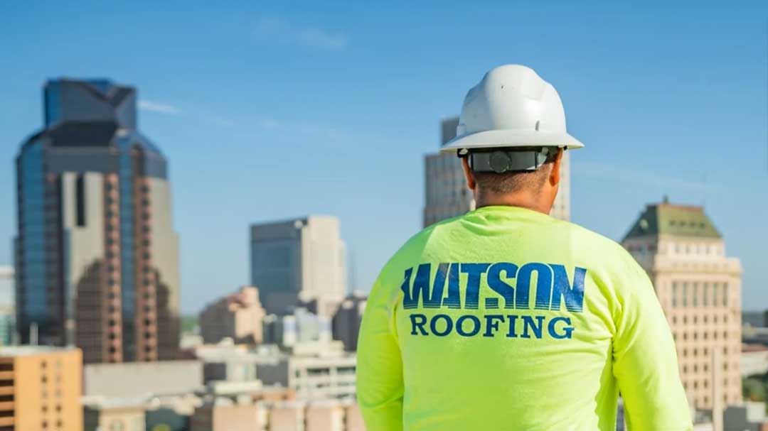
The first thing the Dedicated Designs team did was go out to one of their job sites and capture photos of one of their crews working. We wanted clean and up-close photos of the humans that make Watson what it is. Especially for industrial companies, most websites do not focus on the human element of their business even though that is what visitors want to see. Yes, pretty pictures of buildings, landscapes, food, etc. give a sense of what a business does – but marketing is all about psychology, and psychology says that humans want to see other humans.
The image shown below is a still-capture of an aerial view video that plays on the Home page. While the video is behind text messaging and easy call to action options, it is impactful imagery that tells a story of what Watson Companies Inc. is all about. You can see both the pristine roof and at least two workers in their neon green Watson-branded shirts as they carry out their jobs.

When people are making decisions about which business to give their money and time to, they must be able to see themselves doing business with that specific company. The easiest way to facilitate that is to show other humans on your website. We knew we had to give Watson a human element and these pictures were the first step we took in that direction.
One of the first areas of the website redesign we worked on was the Team page. Continuing with our theme of focusing on the human element of the company because that is how Watson best thought it stood out amongst its peers we built them a very engaging team page. Not only was the design of this page well thought out but the team at Watson had some fun with it in that every person on the team wrote up a little bio and answered a few questions that we then loaded onto their profile.

The team page at first glance is very minimal with each person having only their headshot, name and title. However, next to each person is a little button that can be clicked on and it opens up an expanded profile view where users can see a larger picture and read that person’s answers to a list of standardized questions. Watson came up with the questions, and most are fun rather than the standard line of questioning seen on a lot of other company websites.
The Color Connection
The second piece we tackled was the color palette. Watson already had a few shades of dark blue that it wanted to use because the colors were in its logo. However, we needed to broaden the palette a bit to incorporate some colors that would make the brand stand out.
Our creative team along with Watson Companies Inc. decided upon the neon green that you see on the site. It is subtle yet moving and shows that Watson is a modern company – without actually saying it. Plus, it ties into a lot of the photos as the green we chose is the same green that the safety vests the team wears in the pictures our team captured for the website.
One of the biggest mistakes a lot of designers make is not playing off the colors in the images. A lot of websites have images that do not tie into the overall color palette of the site and clash with the site as a user scrolls. The goal is to have the images incorporate a lot of the same accent colors that are used on the website so they do not completely blend into the main colors of the site, but also do not completely stand out.
Adding Interest Through Movement
The Dedicated Designs web designers also wanted to give the site some depth so that the background looked like it was literally behind the images and text boxes. We did this through the use of shadows, different textures, and parallax scrolling. You can see on the site how it looks like some of the elements feel like they are stacked.
Lastly, Watson roofs large buildings so we wanted the website to match that feel of largeness. The images are large and colorful and focus on a few specific workers to really bring out the human element. Moreover, there are a few images that capture the Sacramento skyline, giving a nod to all of the buildings Watson has roofed, and also giving the site a larger-than-life feel while also providing depth.
The image below shows a section of the website that uses video, starting with a focus on a few members of the Watson team. As the video pulls out the web visitor sees more and more of the expansive work the Watson crew is accomplishing. Commercial roofing now feels like an exciting undertaking with a team of people who care about the results, rather than an item on the maintenance checklist.

Does Your Business Need a Modern Website Redesign?
If your website is out of date, doesn’t tell the story of your brand well, or simply isn’t functioning as needed our team at Dedicated Designs can work with you to create a modern web design that highlights the best aspects of your business. Contact us today to start your website redesign!


